
Colour
12 December 2025 · 4 min read
Red & Green Should Never Be Seen... How to Break Colour Rules Beautifully
Some design "rules" have been repeated for so long that they start to feel like universal truths. But like many traditional rules, this one can be rewritten.
By Suze Patel
Some design "rules" have been repeated for so long that they start to feel like universal truths. One of the most well-known is the idea that red and green should never sit together in an interior, and when we think of the classic bright Christmas palette, it's easy to see where that belief comes from.
But like many traditional rules, this one can be rewritten. Red and green can look incredibly elegant and harmonious when approached with intention. The key is understanding how to combine them in a way that feels soft, grounded and natural.
Where the rule comes from
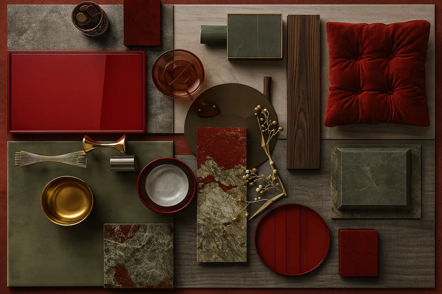
Historically, the pairing was avoided because the bold, saturated versions of red and green create a strong contrast that can feel visually loud or seasonal. In their pure forms they fight for attention, and the space can feel unsettled.
The secret is not to avoid the pairing altogether; it's to rethink the tones.
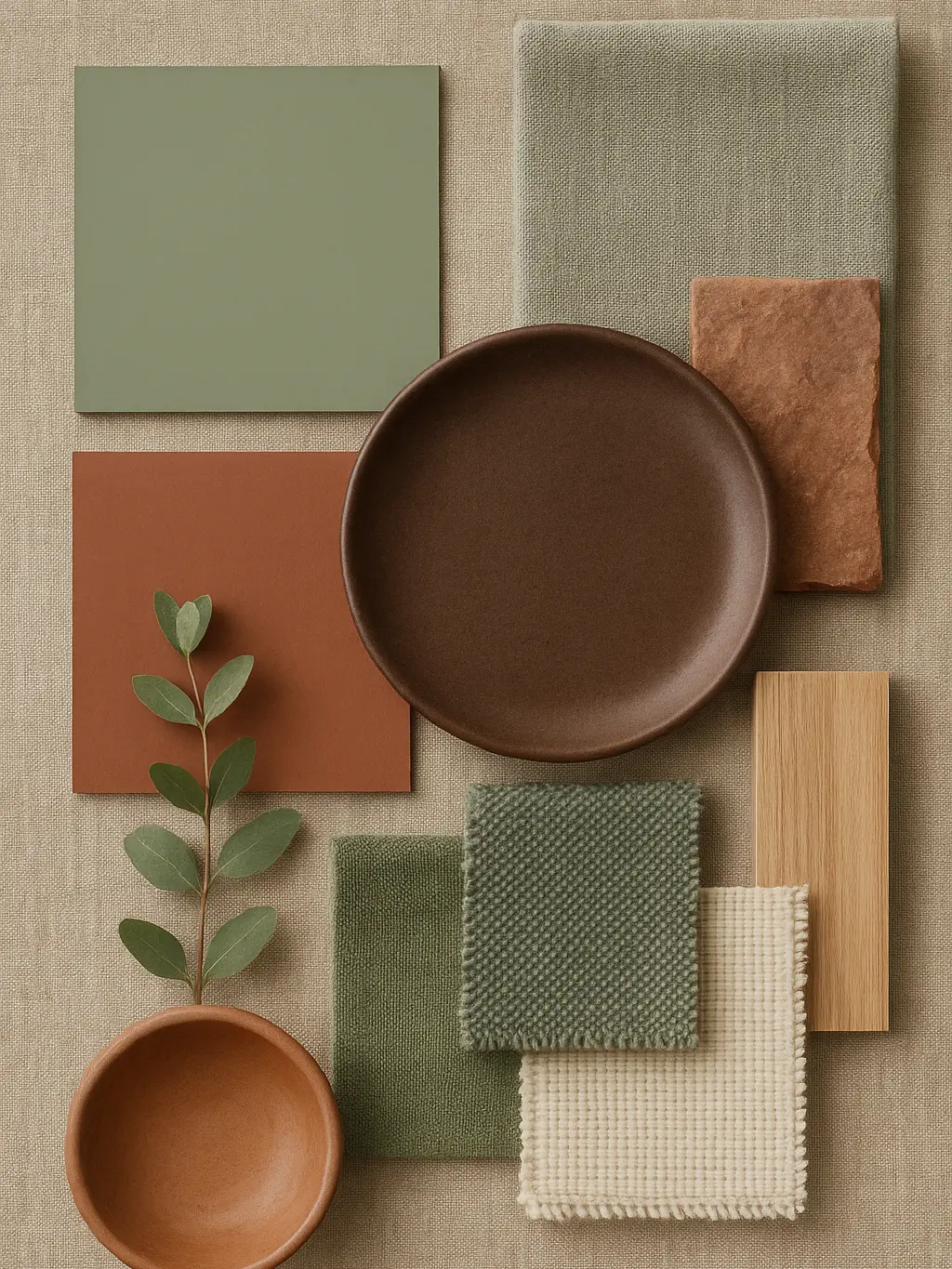
Choose muted, natural tones instead of bright primary colours
Terracotta, clay, rust, moss, sage, olive, eucalyptus; these are versions of red and green that appear naturally in the world around us. Instead of clashing, they complement one another beautifully because they share earthy, organic undertones.
Muted tones instantly soften the palette, creating a sense of warmth and calm rather than contrast.
Let nature guide the combination
If you ever feel unsure, look outdoors for reassurance. The natural world puts reds and greens together constantly:
- Terracotta roofs surrounded by foliage
- Clay soil meeting deep green woodland
- Red bark against moss
- Fruits and leaves growing on the same branch
When in doubt, borrow from these pairings.
“Nature rarely gets the palette wrong.”

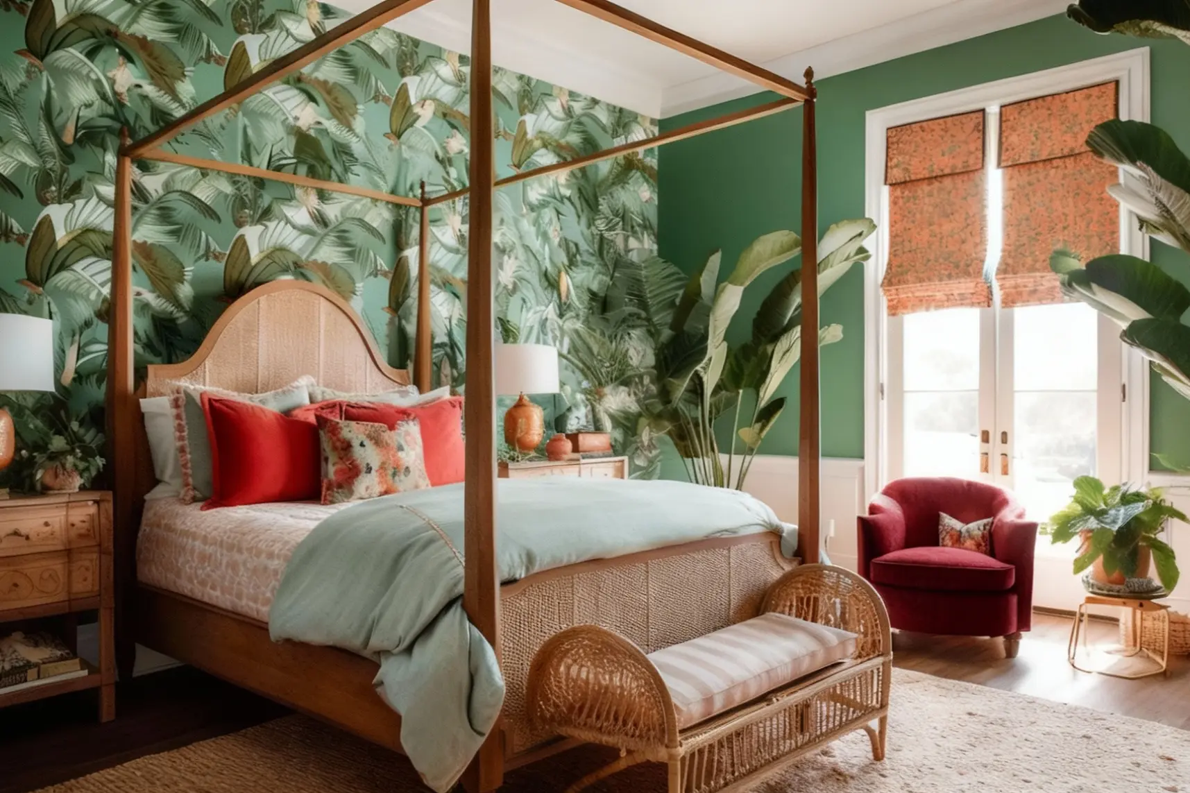
Balance the proportions
A pairing feels intentional when one colour leads and the other supports. For example:
- A sage wall with terracotta accent seating
- A rust sofa with sage cushions and soft green panelling
When both colours are used in equal intensity, your eye doesn't know where to land. Choose a dominant tone, then bring in the secondary colour through textiles, accessories or architectural details.
Use texture to soften the contrast
One of the easiest ways to make red and green feel harmonious is by incorporating tactile materials. Think linen, wool, boucle, timber, matte ceramics, natural stone.
Texture adds softness and visual depth, diffusing any harshness between the colours and bringing them into a more organic balance.
Keep the rest of the palette grounded
Red and green shine when surrounded by warm neutrals and natural materials. Try layering in:
- Warm beige or oatmeal
- Soft stone grey
- Natural oak or walnut
- Creamy plaster tones
This keeps the room feeling calm and connected rather than busy.
Where this palette works especially well
Red and green combinations feel particularly beautiful in spaces that lean toward natural materials and soft, tonal styling, such as:
- Living rooms with timber and greenery
- Cosy reading corners
- Earthy dining spaces
- Biophilic-inspired bedrooms
The palette has depth, warmth and a gentle nod to nature, without ever feeling festive.
A final thought
Design rules can be helpful, but they're not fixed. Some of the most memorable, soulful spaces come from gently bending those rules to create something more personal.
Red and green can absolutely live together beautifully. It simply takes the right tones, textures and balance.
“The most memorable, soulful spaces come from gently bending the rules.”
Filed under
colour